
Gillian Ayres (born 1930) studied at the Camberwell School of Art in London and was close friends with of many artists of her time such as Howard Hodgkins and Robyn Denny. In the 1960s Ayres was creating very free and loose paintings using Acrylics which were inspired by photos Jackson Pollock working on the floor. However as time went on her style developed and by the end of the 70s she was using Oil paint to create structured and textured paintings inspired by internal forms (often taking the shape of circles and squares).
Gillian Ayres still creates vibrant and stimulating paintings/prints to this day and I recently had the privilege of seeing her latest work (2013-2014) at a small art gallery in North Devon.

i Oil on canvas (both)

ii Woodcut on Unryu-shi Japanese Paper

iii Woodcut in Japanese Unryu-shi Japanese Paper (both)
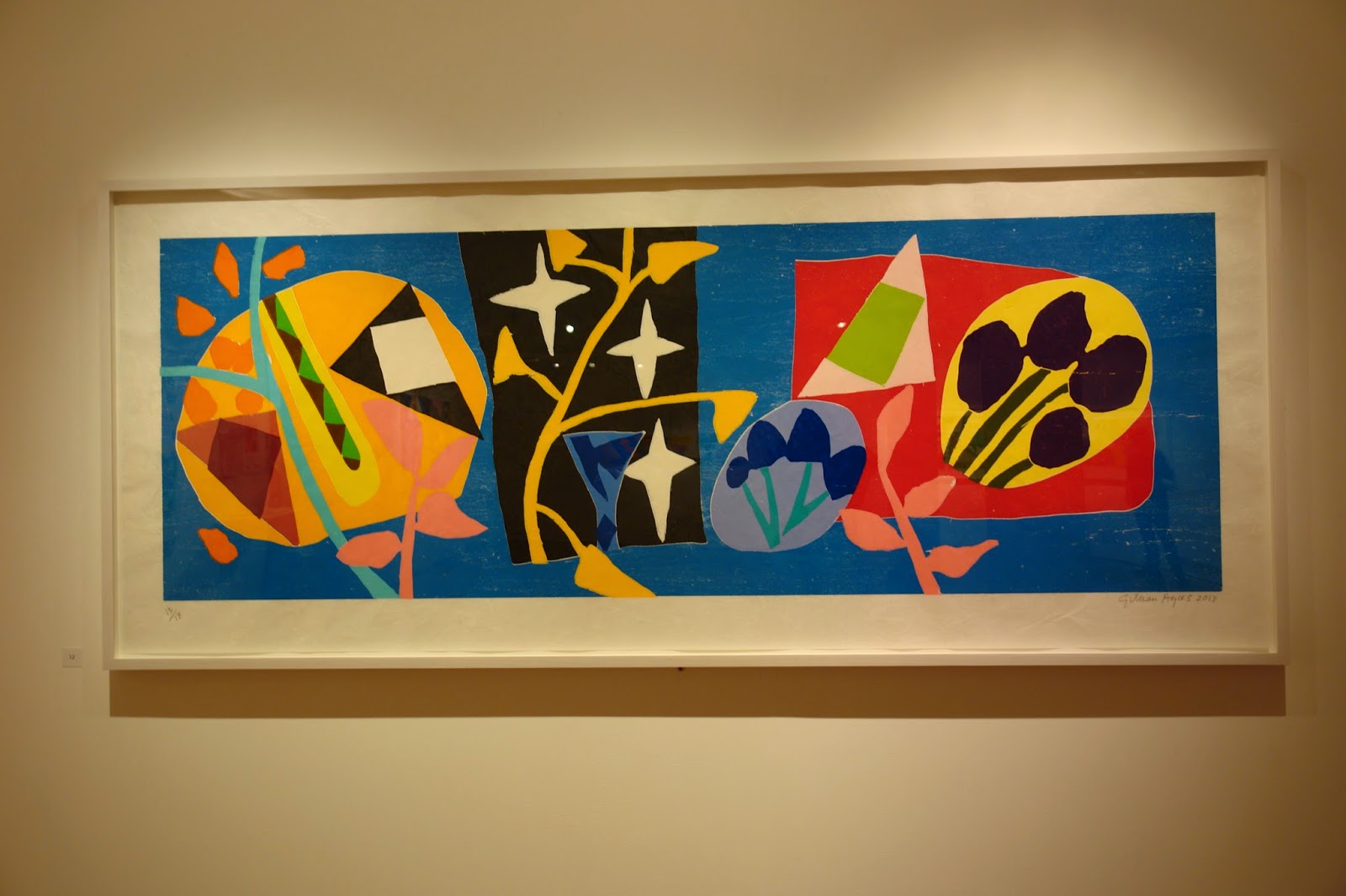
iv Woodcut on Unryu-shi Japanese Paper

v Sugar-Lift Aquatint and Carborundum (left) Woodcut on Unryu-shi Japanese Paper (right)

vi Sugar-Lift Aquatint and Carborundum
Paintings
Gillian Ayres' paintings which were on exhibit varied in size from small, compact pieces to large, confrontational canvases. One of the first things I noticed on walking into the gallery space was the use of bright colours in her work. The paintings used vibrant, sugary colours which, although very saturated, were soft and easy on the eyes. I personally interpreted a lot of the colour schemes in the work as being quite feminine, I think I felt this because of her use of pastel colours which she used to complimented and tone down the saturated, bold hues. Although from a distance the paintings look like solid blocks of colour, on closer inspection, the viewer will find that each section is actually composed of many different tints and shades of the same hue which have been loosely applied together. This is an aspect of her work that I really admired.
The oil paint which Gillian Ayres' thickly applied to her canvas to create these paintings had a roughly textured spontaneous look to it. As a fan of impasto painting techniques I was delighted to see such a loosely textured surface on the paintings.
Ayres' use of colour was not the only thing that made the paintings so captivating, these abstract images were also extraordinarily composed. The viewer, when observing her work, will find that each piece has the feeling of being even, compact and complete. The composition was perfectly balanced. I would love to see her paintings made into textiles or perhaps simply and thickly painted onto cloth which would also capture the texture.
Prints
Sugar-Lift Aquatint and Carborundum
I had never heard of this printing technique before encountering it at this exhibition. These prints had a very unique wet and glossy look to them. The large patches of ink looked mottled and uneven as if the pigment had been squeezed out of tube and a fine sheet of glass had been placed on it.
These prints gave off a general smudged messy look, I think this was reinforced by the fact that a few had small, coloured patches around the edges which gave an impression that the pigment had bleed off the designated area (although this is not the case as the colours used around the edge are not mirrored in the print). These personal observations are in no way derogatory, I actually thought the prints were incredibly beautiful (especially the print featured in photo vi), their sugary, bright hues and glistening surfaces were personally my favourite qualities.
Woodcut on Japanese Unryu-shi Paper
The woodcut prints were just as bright and cheerful as Ayres' other work on display at the Burton Art Gallery. One quality I admired about these prints that the paintings and sugar-lift aquatint and carborundum prints did not have so distinctly was the very clean, sharp edges separating the shapes. The organic shapes in these prints overlapped in places which gave the the composition a more connected and interlocking feel.
I also adored the Japanese Unryu-shi paper that the woodcut was printed onto and how it's rough texture was evident underneath the print. The grain in the wood was also clear in the print, it contrasted the rough texture of the paper with long, curving lines.
This exhibition was very enlightening, as a lover of more classical art I do not often look at such abstract images, however, after seeing Gillian Ayres' work I have realised that I enjoy more modern forms of art just as much as I do the victorian, renaissance or medieval!


